

Let’s face it — no one wants to read pages of pure numbers. Even your thesis panel doesn’t. That’s why presenting your data visually in Chapter 4 (or any part of your research) isn’t just a nice touch — it’s essential. Tables, charts, and graphs help translate your research data into digestible insights that make your research more credible, professional, and easier to understand.
In this blog, we’ll walk you through when to use visuals, which type to choose, how to make them effective, and the common pitfalls to avoid.
Why Visuals Matter in Research
Numbers can be intimidating. But visuals — when used correctly — can simplify even the most complex results. Here’s why they matter:
- 📊 They highlight trends and patterns at a glance.
- 📉 They help readers retain key points.
- 🧠 They break visual monotony, especially in a long thesis or dissertation.
- 👀 They’re panel magnets — reviewers often scan charts and tables first before reading detailed interpretations.
So, if your visuals are messy, inconsistent, or confusing? It reflects poorly on your entire study. But well-designed visuals? They elevate your credibility.
When to Use Visuals (and What Type to Choose)
Not every piece of data needs a chart, but if your goal is to show, not just tell, then here’s a quick guide to the best visual for your purpose:
| Goal | Best Visual Tool |
|---|---|
| Show parts of a whole | Pie Chart |
| Compare categories or groups | Bar Graph |
| Show change over time | Line Graph |
| Present raw values | Table |
| Show relationship/correlation | Scatter Plot / Matrix Chart |
📌 Example:
- Pie chart: To show what percentage of respondents fall into each category
- Bar graph: To compare the scores of male vs. female respondents
- Line graph: To track academic performance across semesters
- Table: To show exact frequencies or scores
How to Create Effective Visuals
Here’s how to ensure your visuals actually work:
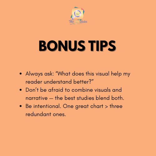
✅ 1. Keep It Simple and Clear
Don’t go overboard. Use minimal colors, clean lines, and legible fonts.
❌ Overkill: Neon bar charts with drop shadows
✅ Better: Neutral tones with clear contrast
✅ 2. Label Everything
Every visual should have:
- A title (e.g., Table 1: Frequency of Study Habits)
- Axis labels (for graphs)
- Units of measurement
- A legend if necessary
If someone looks at the visual without reading the full chapter, they should still understand what it means.
✅ 3. Match Your Visual with the Text
Each table or chart should be mentioned in your narrative.
📌 Example:
“As shown in Figure 2, 68% of respondents preferred morning study sessions over evening ones.”
This avoids the dreaded “floating chart” syndrome, where visuals appear without explanation.
✅ 4. Follow Formatting Standards
Use your university’s required formatting (APA, MLA, etc.). This includes:
- Proper numbering (e.g., Figure 1, Table 3)
- Correct caption placement
- Consistent font size and style
If you’re using SPSS or Excel, take time to format the export so it matches your paper’s aesthetic.
Common Mistakes to Avoid
🚫 Visuals with no explanation
Never insert a graph without discussing it. It’s like posting a meme without a caption — confusing and easily misunderstood.
🚫 Using visuals for the sake of visuals
Only include a chart if it adds value. Repetitive or irrelevant visuals just clutter your paper.
🚫 Going overboard with effects
Avoid 3D charts, rainbow colors, and extra styling. These reduce clarity and distract your reader.
🚫 Forgetting to number and title
Each figure and table must be properly labeled so they can be referenced later.
Tools You Can Use
You don’t need fancy software. Here are beginner-friendly options:
- Google Sheets / Excel – Simple, customizable, export-ready.
- SPSS – Automatically generates tables and charts from your data.
- Canva / PowerPoint – Good for visual polish if your panel prefers clean designs.
- Datawrapper / Tableau Public – For more complex or interactive visuals.
No matter what you use, the goal is clarity and impact — not visual noise.
Remember, your visuals tell a story. Make it clear, compelling, and worthy of your research efforts.
📣 Need Help Presenting Your Data?
The Writeler Co. is here to support students and professionals who are juggling research with work, life, and business. Whether you’re writing a thesis, capstone, or dissertation for your master’s or Ph.D., we help you efficiently navigate the research journey — from brainstorming to proofreading.
📩 Message us today to get started.
📚 Let’s turn your research idea into a powerful paper.

0 Comments